array.forEach(item => {
   sum += item
});

array.reduce((sum, num) => sum + num, 0);

for(const num of arr) {
   sum += num;
}

for(let i=0; i<arr.length; i++) {
   sum += arr[i];
}
Traditional for loop is the fastest way to go through array of elements and do any calculations. Of course, with number of elements about few hundreds, performance is almost even. Advantage is seen, when works on great number of elements (tausends).
But it is good to keep healthy habits.
Searching on array with non number elements (text, emails etc).
// standard includes method
for(const value of lookupValues) {
   testData.includes(value);
}

// using Set of Data
const testSet = new Set(testData);
for(const value of lookupValues) {
   testSet.has(value);
}
Using new Set with searching with has, is million times faster than includes. Why? Because Set makes elements indexed. So searching is much faster.
Worth only for huge arrays (on small, preparing new Set, can consume advantage).
The fastest one is quickSort(). Why is that? Because it is the simplest sorting algorithm. Fancier algorithms have tendency to be harder to implement and be more buggier.
CSS provides a variety of tools to control the layout and alignment of elements on a web page. One of these tools is the inline-flex value for the display property. While flex creates a block-level flexible container, inline-flex creates an inline-level flexible container. In this article, we’ll explore how to use inline-flex, why it’s useful, and practical examples to demonstrate its power.
What is inline-flex?
inline-flex is a value of the display property that combines the characteristics of both inline and flex layouts:
Inline behavior: The container itself behaves like an inline element, meaning it flows with text and other inline elements, and does not break into a new line.
Flex container: Its children are laid out according to the rules of the flexbox model, allowing for powerful alignment, spacing, and ordering options.
Syntax
Here’s how you can set inline-flex:
.container {
  display: inline-flex;
}
Why Use inline-flex?
Aligning Inline Elements Use inline-flex when you want multiple elements to align horizontally (or vertically, with flex-direction) but still flow inline with surrounding content.Example: Aligning icons and text in a button.htmlCopy code
Combining Text and Media Use inline-flex to align images, icons, or other visual elements with text. Unlike inline-block, inline-flex allows for dynamic distribution of space using justify-content and align-items.Example: Inline image with caption
Responsive Inline Layouts inline-flex can be a great choice for small layouts, such as navigation links or badges, that need to scale gracefully and stay inline with other elements.Example: Navigation bar
Vertical Alignment inline-flex is especially useful for vertical alignment when combined with align-items. For example, centering content vertically within an inline element.Example: Badge with centered text
Combine with gap: The gap property works well with inline-flex for spacing child elements without additional margins.
Control Wrapping: Use flex-wrap to manage how children wrap when there isn’t enough space.
Responsive Design: Combine inline-flex with media queries for adaptable designs.
When Not to Use inline-flex
While inline-flex is versatile, there are cases where it’s not ideal:
Avoid it for full-width layouts or elements that should span the entire container. Use flex instead.
For very simple inline alignment, inline-block might suffice and reduce complexity.
Conclusion
inline-flex is a powerful and flexible tool for creating inline layouts that require dynamic alignment and spacing. Whether you’re designing a button, aligning icons with text, or building responsive navigation, inline-flex provides the perfect blend of inline and flexbox capabilities. By mastering this property, you can create more polished and adaptable web designs.
The shorthand CSS property flex sets how a flex item grows, shrinks, and defines its base size in a flex container. The values 1 1 0 represent the three components of the flex property:
flex-grow (1): Determines how much the flex item will grow relative to others when there is extra space available. A value of 1 means the item will take up an equal portion of the available space in the container (proportional to other items with the same flex-grow value).
flex-shrink (1): Specifies how much the flex item will shrink relative to others when there is not enough space in the container. A value of 1 allows the item to shrink as needed, proportional to other items.
flex-basis (0): Defines the initial size of the flex item before the remaining space is distributed. A value of 0 means the item has no intrinsic base size, so its size is determined entirely by the flex-grow and flex-shrink factors.
Behavior of flex: 1 1 0:
The item can grow and shrink equally relative to other flex items.
It has no predefined size (flex-basis: 0), so the container’s remaining space will be distributed among all flex items according to their flex-grow values.
Flexbox is a popular layout tool, and flex-wrap is often used to handle item wrapping when screen sizes change. However, CSS Grid provides a more robust and intuitive alternative for responsive layouts. By leveraging grid-template-columns with the minmax() function, you can create layouts that adapt dynamically to different screen sizes, without needing to rely on Flexbox wrapping.
Here’s how you can replace flex-wrap with CSS Grid effectively.
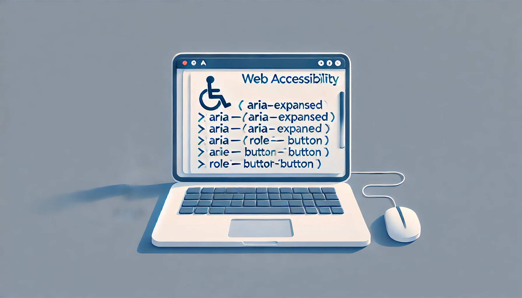
Getting Real with ARIA Attributes for Web Accessibility
Let’s talk about web accessibility—making sure everyone, including folks with disabilities, can use your website. ARIA (Accessible Rich Internet Applications) is here to help you beef up your web game so assistive technologies like screen readers can understand what’s going on. Here’s the lowdown on ARIA, why you should care, and how to use it without overthinking things.
What’s the Deal with ARIA Attributes?
ARIA attributes add extra meaning to your HTML so that assistive technologies know what’s what. They’re great for filling in the gaps when plain HTML doesn’t cut it for interactive stuff like dropdowns, sliders, or tabs. Think of ARIA as the subtitles for your web content—super helpful for people who need them.
If you add html5 elements like <nav> <header> <footer> etc., then roles are implemented correctly. But with simple <div>, we need to inform browser/reader about elements role.
Why Bother with ARIA?
Make Stuff Accessible: ARIA helps you create fancy, dynamic content that works for everyone.
Keep Things User-Friendly: Whether someone uses a mouse, keyboard, or screen reader, ARIA makes it easier for them to interact with your site.
Stay on the Right Side of the Law: Accessibility isn’t optional anymore—it’s a legal and ethical must.
ARIA Attributes You Should Know
Roles: What Things Are
Roles tell assistive tech what an element does:
role="button": Says, “This is a button.”
role="alert": Marks an area as a “Heads up! Something just happened.”
role="navigation": Identifies a navigation section.
States: How Things Are Right Now
States are dynamic. They change as users interact:
aria-expanded: Tells whether something like a dropdown is open or closed. <button aria-expanded="false">Menu</button>
aria-checked: Indicates if a checkbox or toggle is checked. <input type="checkbox" aria-checked="true">
Properties: The Extra Details
Properties give more context about an element. They usually stay the same:
aria-labelledby: Links to the ID of an element that labels something. <label id="label1">Name</label> <input type="text" aria-labelledby="label1">
aria-describedby: Points to an element that gives more details. <button aria-describedby="desc1">Info</button> <div id="desc1">This button opens the settings panel.</div>
Pro Tips for Using ARIA
Stick to HTML First: Native HTML elements already come with built-in accessibility. Use ARIA only when you really need it.
Less is More: Don’t overdo it with ARIA. Adding too much can confuse assistive tech.
Test Everything: Use screen readers like NVDA or VoiceOver, and tools like Axe or Lighthouse to check your work.
Keep ARIA Updated: If a state changes (like aria-expanded), make sure you update it in real-time.
Follow the Rules: Check the official WAI-ARIA docs if you’re unsure about anything.
Avoid These Rookie Mistakes
Role Overkill: Don’t give elements roles they don’t need. It’ll mess things up.
Ignoring Keyboards: Make sure users can tab through and interact with everything.
Forgetting Updates: If you’re using dynamic ARIA states, update them properly or you’ll leave users in the dark.
Wrapping Up
ARIA attributes are like secret weapons for accessible web design. They’re powerful, but you’ve got to use them wisely. Stick to the basics, test everything, and always put yourself in the shoes of your users. Accessibility isn’t just about following rules—it’s about making the web a better place for everyone.
Examples:
Adding alt attribute to img tag
<img src="path/to/image.ext" alt="alternative text to image">
Getting label from other tag
<div class="card">
	<img src="path/to/image.ext" aria-labelledby="img-caption-1">
	<div class="text-container">
		<p id="img-caption-1">Description to card and image</p>
		<button>Learn more</button>
	</div>
</div>